This week I’ve been learning about layout in design. The danger of already knowing a lot is that I don’t do everything as I should and miss out on new knowledge.
I took a stab at designing a info ad in for a local newspaper. This was one of the tasks in the module and this is what I came up with.
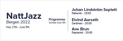
Unfortunately it turned out a little grainy, but it still shows what I did. It is divided into two sections: The what/when/where to the left and then the program to the right.
Personally I think this design looks clean, simple and easy to get a hold of the needed info. It’s clear who is going to play where and when. If the viewer looks for one specific artist then they don’t have to look through tons of info.
If I were to change it, I’d make the date a little bigger or bolder so it popped a little. But I think this works.
Greater things are yet to come //

Legg igjen en kommentar