Studying the history of things is how we learn and move forward to do more incredible things. In my opinion, this also goes for design.
I researched the Swiss design trend a little bit and found a design
I liked.
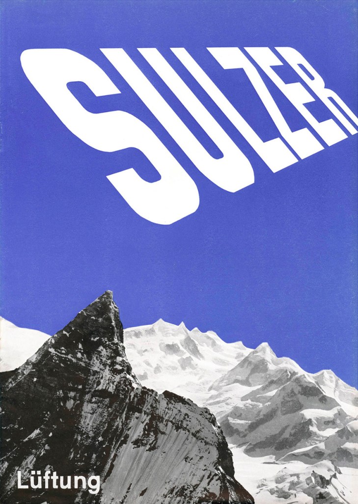
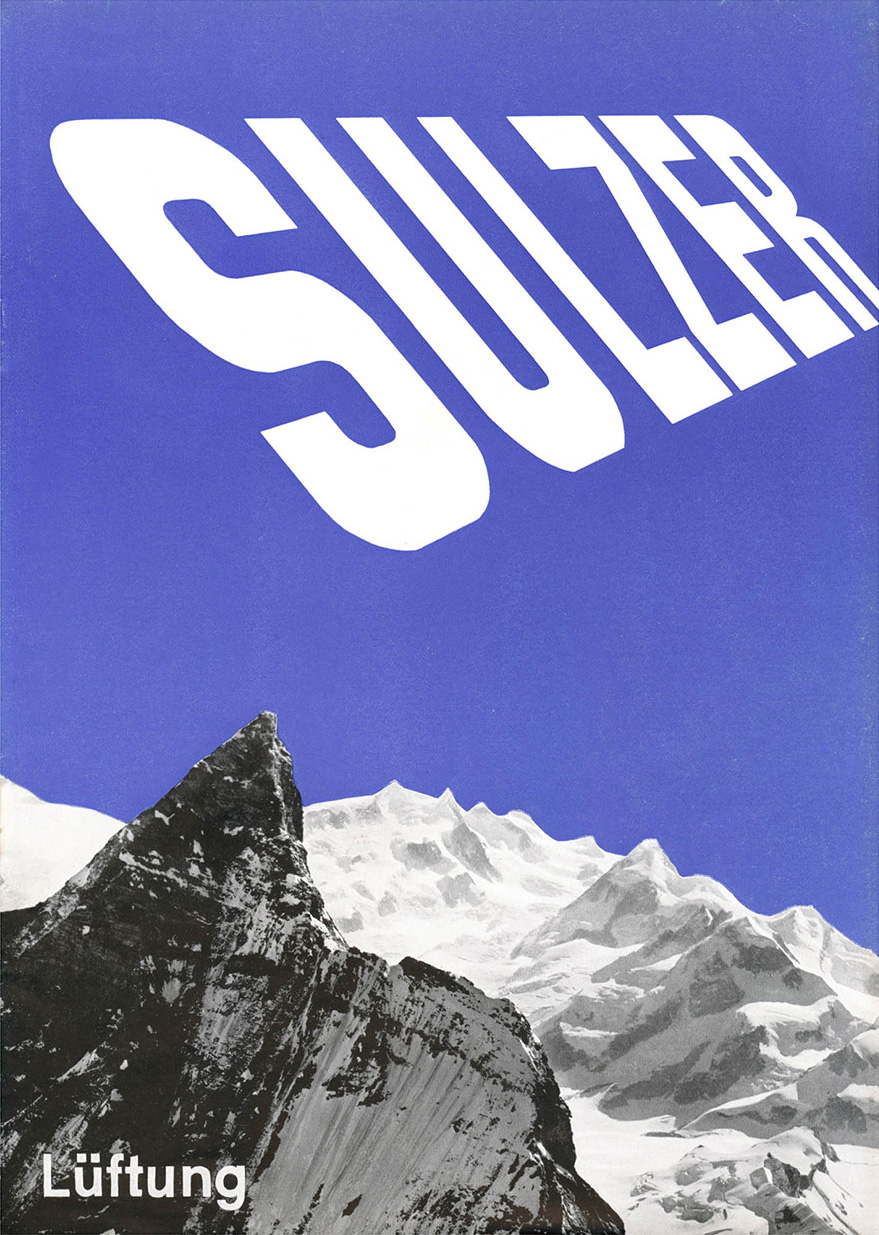
I found a design Anton Stankowski created with Hans Neuburg for Gebrüder Sulzer AG.
This brochure cover from 1933 is a Swiss design trend and utilizes a tall sans-serif font.
The design’s simplicity, contrast, and movement caught my eye when I first saw it.
I think this design points out that less is more. There’s no need to add anything more to this, but if anything were removed, there would be an imbalance. I also think this is an excellent example of contrast: the contrast between the jagged peaks and the clean lines of the font.
I intend to consume as much knowledge as possible. The best way is through Illustrator tutorials.

This tutorial was on Mobius eye, a rotating effect used in graphic design as textures or as bigger parts of logos.
Greater things have yet to come.

Legg igjen en kommentar